Liza

I design interfaces for complicated things and try to keep them clear and calm.

Product designer

©2026

Selected work
01Selected work

Three projects, from a problem to a finished design.

02About

I’mLiza,
a product designer
who likes untangling
complex things.

I started in graphic design, spending years on print and books. I bring that eye for type and detail to every screen I design today.

03Playground

Side projects and experiments.

Dot Matrix

The alphabet on an 8×10 dot grid. WebGL.

Glow Widget Kit

Steps, a day streak and a gooey slide, prototyped with Claude.

Hands animation

Animated illustrations for a website.

Art school cards

Cards for a children's art school website.

01 / 04
04Contact

Let’s talk

Have a project, a role or a question? I reply within a couple of days.

elizavet.zan@gmail.com LinkedIn Behance
01Case study

Steady

A job tracker based on what job seekers find hardest: rejections piling up, and keeping everything up to date.
Role
Solo product designer
Year
2026
Type
Self-initiated
Platform
Web app, desktop
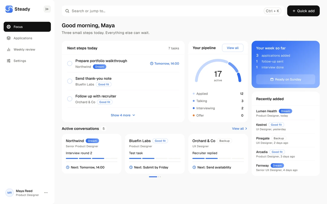
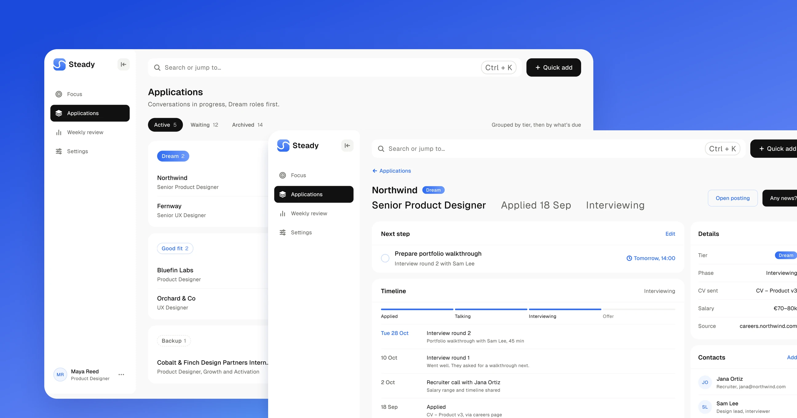
Steady on desktop: the applications list grouped by tier, and an application open with the Any news? sheet on top.
01Overview

A job tracker for a calmer search.

Steady keeps every application, next step and conversation in one place. It shows what to do today and keeps the outcomes nobody controls out of the way.

Goal

Make keeping track take seconds, and make opening the app feel safe even in a week full of rejections.

Scope

5 flows on desktop: first run, quick add, applications, search and the weekly review.

Status

Self-initiated and not launched, so I describe decisions and intent, not results.

02Problem

People stop tracking to protect themselves.

Job seekers start a spreadsheet, then give up. Every rejection stings and data entry takes too long. Then a recruiter calls about a job they don’t remember applying to.

Rejections on display

A list of red rows is the first thing people see, so they stop opening it.

Typing is a chore

Company, role, link, date and status for every job. After the tenth, nobody keeps up.

Context goes missing

The job ad goes offline and notes live in email, so a surprise call starts from zero.

No clear next step

Links, emails, notes and statuses pile up in different places, so the next step gets lost in the noise.

03Insight

They avoid outcomes, not tracking.

I read through public discussions where job seekers talk about tracking their applications, tagged the problems that kept coming up and grouped them into six themes. People still want context and next steps. What they avoid is a growing pile of outcomes they can’t control.

Hide the scoreboard

Counting rejections hurts. Show what is moving instead.

Seconds to add

If saving a job takes longer than applying, people skip it.

Keep the job ad

Postings disappear. Save the description on the day you apply.

Find a job fast

Recruiters often call about a job you applied to weeks ago. It has to be one search away.

One next step

People want to know what to do today, not a list of statuses.

End things quietly

Six weeks of silence is an answer. Archive it without a ceremony.

04Key decisions

Next steps first, outcomes in their place.

A home that shows what to do today, a job added from a link, updates in two taps and a weekly review where endings are grouped once.

Next steps, not a scoreboard

Home opens on three small steps for today. The pipeline counts what is active, and rejections never show up as a number.

Paste a link, answer two questions

The link fills in company and role. Two taps say if you applied and how much you want it, and that sets the tier.

Any news? in two taps

One question after every call: what happened and when is the next step. Steady adds the prep task itself, and anything skipped comes back in the weekly review.

Endings, grouped once a week

Rejections and jobs with no reply for six weeks are archived quietly and shown together in the weekly review, after the progress. A reason is optional.

05Prototype

First run in motion.

Sign-up and the three setup steps as one loop, ending on Home. The panel on the left warms up a little with each step. Pause it, step back or forward five seconds, or drag the timeline. Prototyped with Claude from my Figma screens.

06Flows

Five flows on desktop.

All five flows on one sheet. Open it full size, then drag to move around and pinch or use + and − to zoom.

07What’s next

How I’d know it works.

Not launched. If it were, I’d follow people from the day they create an account and watch three numbers.

Returnpeople still updating their applications four weeks after sign-up
Answersinterviews followed by a logged outcome within two days
Reviewsweekly reviews finished, not skipped

Forward an email

Forward a recruiter email to Steady and it updates the right application.

Calendar sync

Interview times from Any news? go straight into the calendar.

Steady on the phone

Quick add and Any news? on the phone, for updates right after a call.
03Case study

Sprout

Plants first, account later. A redesign of my onboarding, so people add a plant before the app asks for anything.

Role
Solo product designer
Year
2026
Type
Self-initiated redesign
Platform
Mobile app
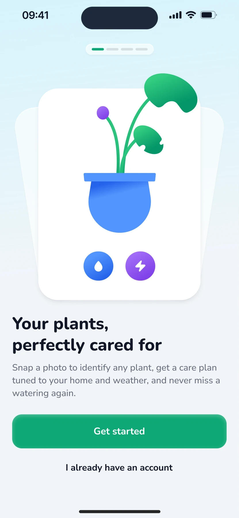
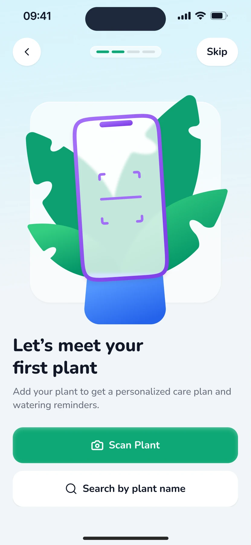
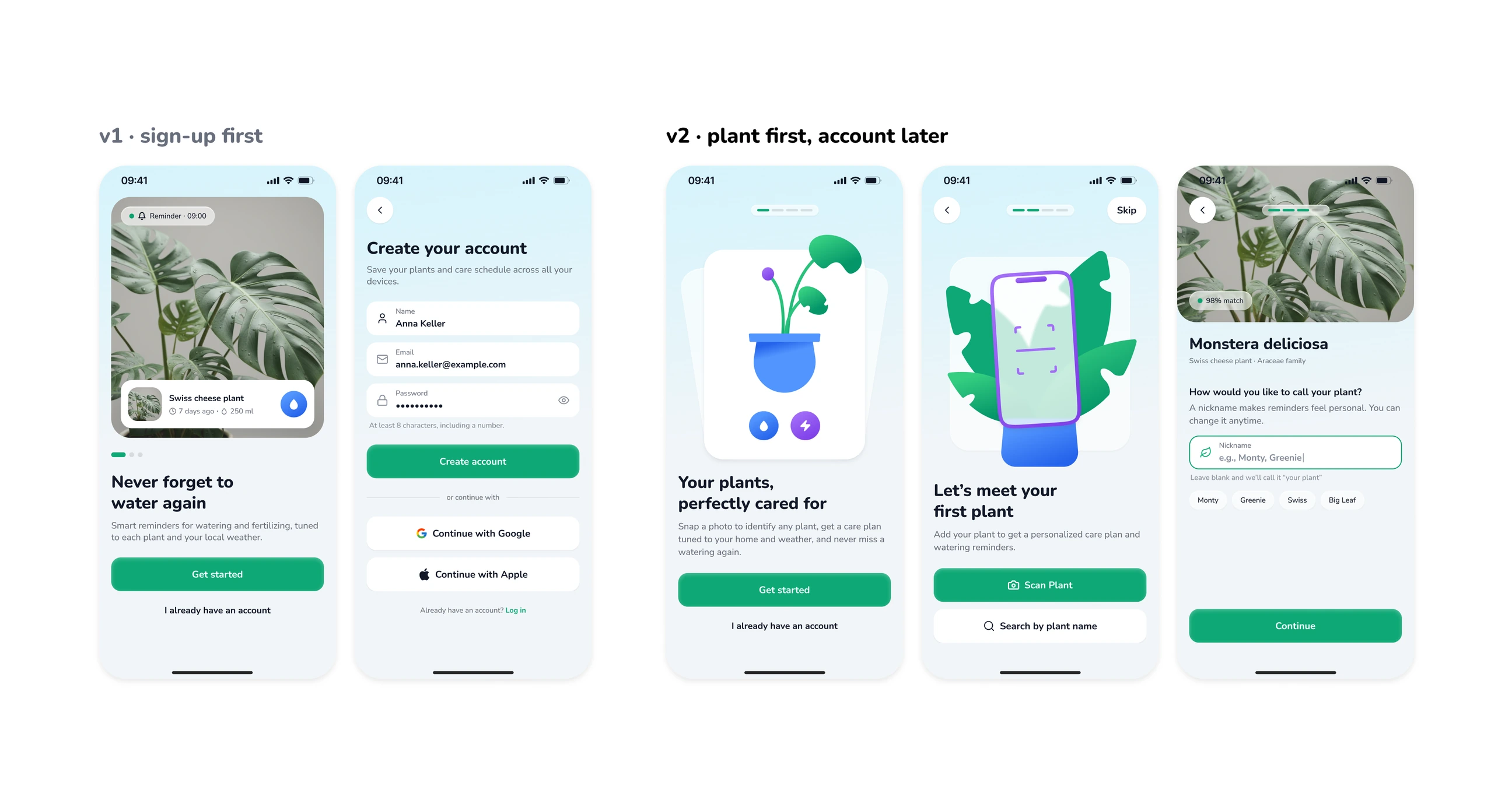
Sprout onboarding, v1 on the left and v2 on the right: v1 asks for sign-up first, v2 lets you meet your plant first.
01Overview

A first plant before any sign-up.

Sprout is a plant care app I designed for myself. This case study redesigns its onboarding so people meet their own plant first and are asked for an account, notifications and a subscription only afterwards.

Goal

Get a first plant into the app before the user is asked for anything.

Scope

Onboarding end to end: 16 screens, 5 branches, the permission and sign-in states, plus an animated prototype.

Status

Self-initiated and not launched, so I describe decisions and intent, not results.

02Problem

My first onboarding asked for everything and explained nothing.

v1 went splash, promise, sign up, permissions. The user never added a plant, so reminders had nothing to remind them about.

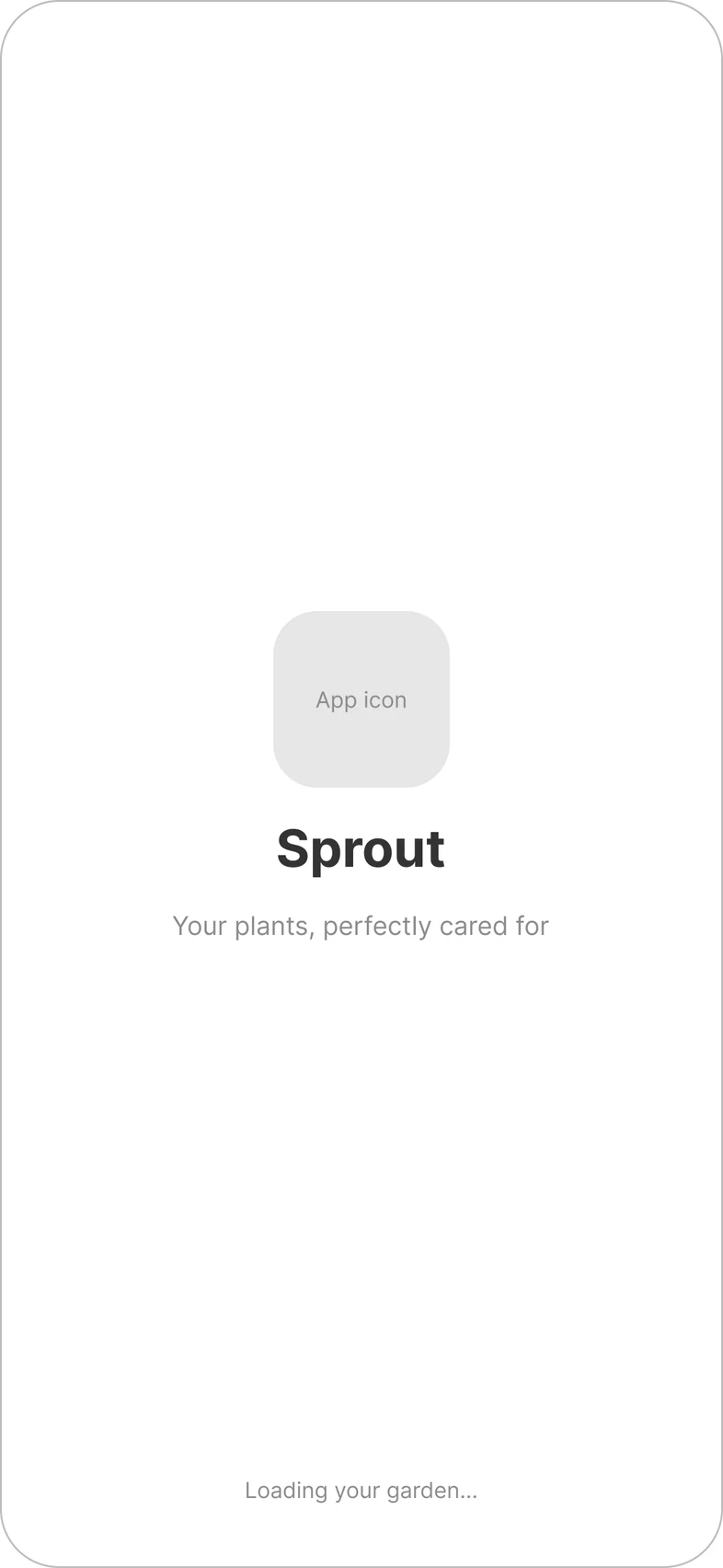
The v1 splash screen: app icon, name and a loading line.
01Splash
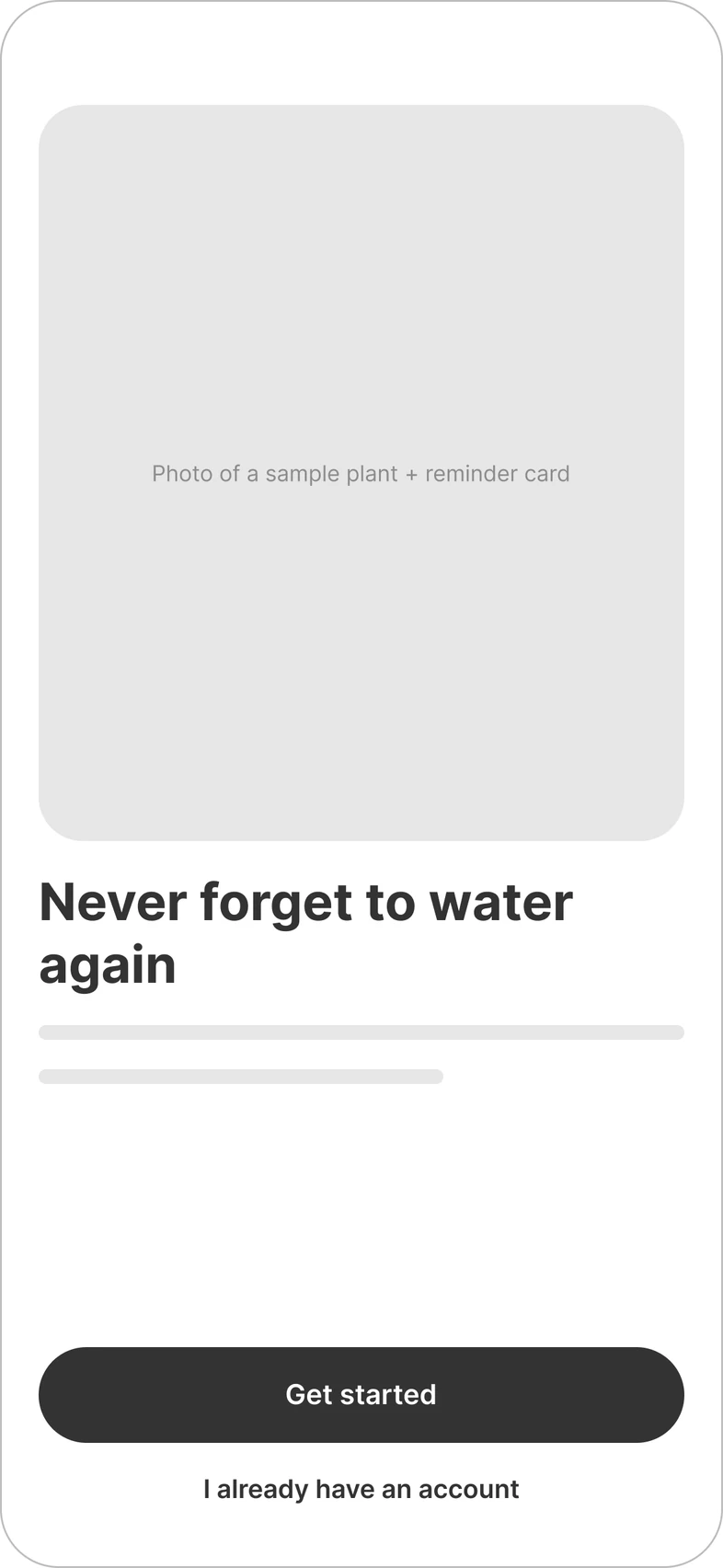
The v1 promise screen: a generic photo, a headline and Get started.
02Promise
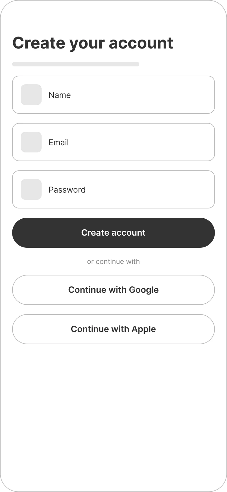
The v1 sign-up screen: name, email and password before any value.
03Sign up
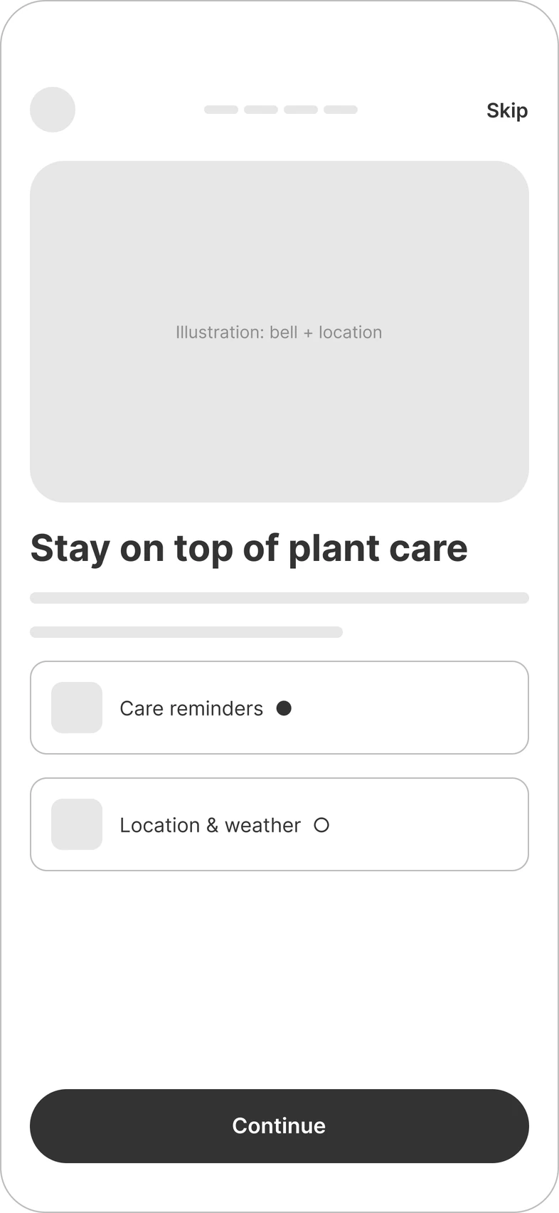
The v1 permissions screen: reminders and location asked together.
04Permissions

Sign-up came first

v1 asked for an account on the second screen, before the user had seen what the app does for them.

Permissions had no reason

Camera and notification prompts appeared out of context, so they read as demands rather than help.

Nothing to remind about

People left before adding a plant, so the reminders, the main feature, had nothing to work with.

03Insight

People need to feel at home before they commit.

Apps in this category that work show the main feature early and make it feel yours. For a plant app, that means seeing your own plant first.

Step 1: Meet a plant
01Meet a plant
Step 2: Name it
02Name it
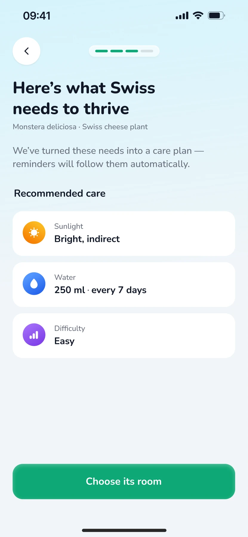
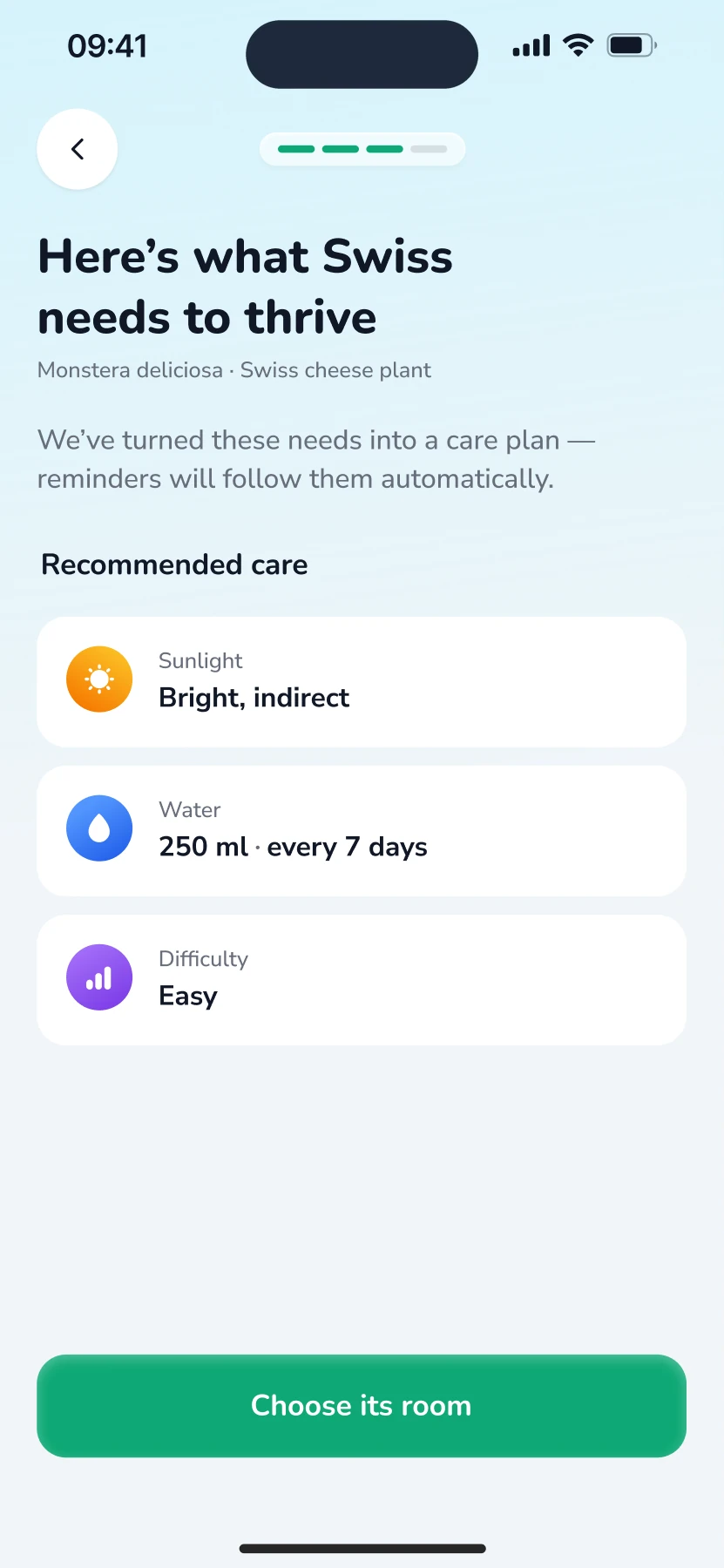
Step 3: Care plan
03Care plan
Step 4: Reminders
04Reminders
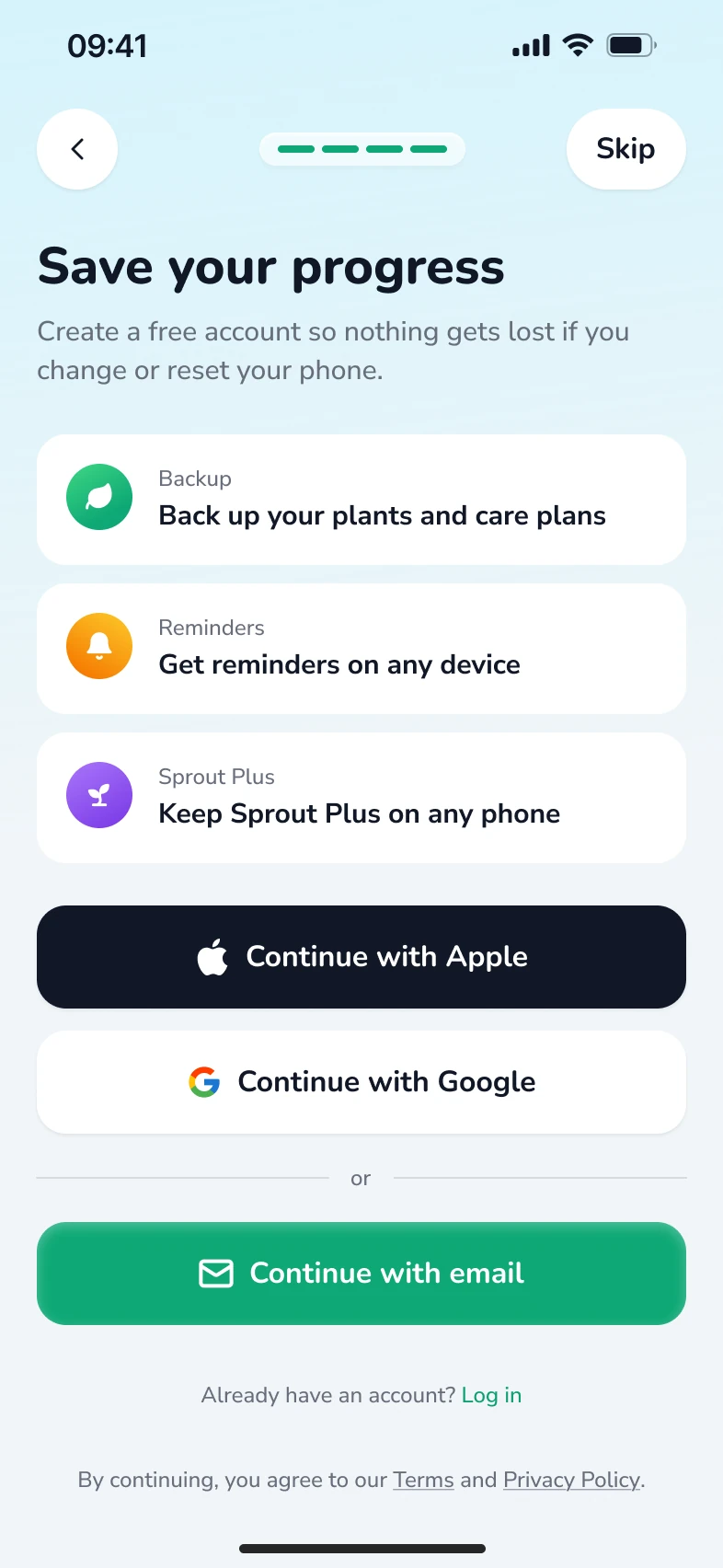
Step 5: Account
05Account

See your own plant first

Scanning a plant is the first action, so the app starts with the user’s own plant.

Ask when it helps

Account and notifications come after the plant exists, each with a one-line reason.

Always a way out

Meet and Reminders can be skipped, and a bad camera never blocks the app, because search by name is always there. Skipping the account asks once before going on as a guest.

04Key decisions

Value first, then the asks.

Plant first and account later, a nickname that makes it personal, and permissions asked in context.

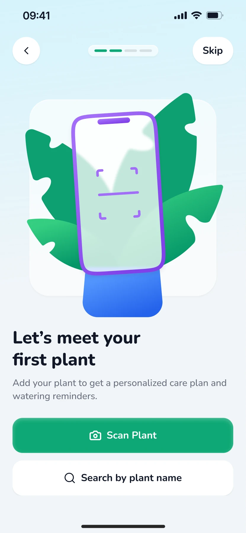
Scan screenSearch by name screen

Scan or search, one next step

Scanning is the default, but search is always one tap away. If the camera is denied, the user lands in search instead of a dead end. Both paths meet at the naming screen.

Name your plant screen

A nickname that follows you

Asking for a nickname makes the plant feel like theirs. “Swiss” then appears on the care plan, the room step and the reminder copy, falling back to “your plant” if left blank, so a long species name never breaks the layout.

Care plan screenReminders screen

Reminders with a reason

The notification prompt comes after the care plan, so it can say what it is for: “Never miss Swiss’s next drink”. Asking in context makes the reason clear.

05Prototype

Onboarding in motion.

The whole flow as one 59-second loop. Pause it, step back or forward five seconds, or drag the timeline. Prototyped with Claude from my Figma screens; the illustration animations were made in Figma Motion.

06Flow

Every path, mapped.

The whole onboarding as one map: 16 screens and 5 branches, including the permission and sign-in states, and where each path rejoins the main flow.

07What’s next

How I’d know it works.

Not launched. If it were, I’d watch three numbers.

Onboardingcompletion rate
Remindersturned on
Day 7return to water
02Case study

Pass.

A trainer for the German exam. Practise one part at a time, take a mock test in the real exam’s format, and keep the words you meet along the way.

Role
Solo product designer
Year
2026
Type
Self-initiated
Platform
Web app, desktop and mobile
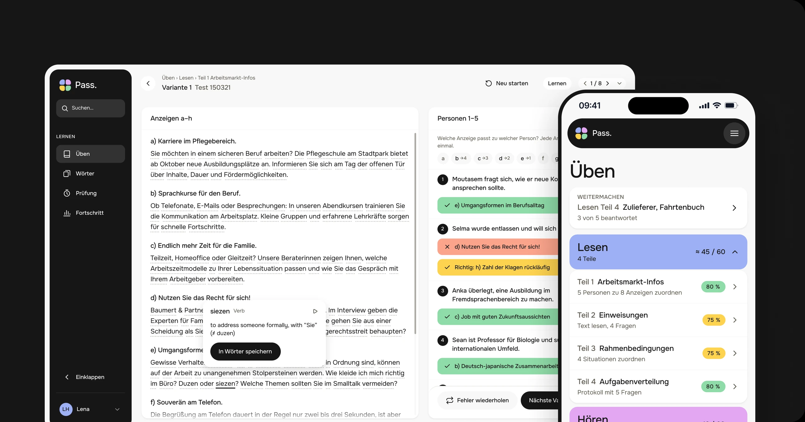
Pass. on desktop and on a phone: a reading task with instant feedback, and the practice overview with one colour per exam module.
01Overview

One place to get ready for the German language exam.

Pass. prepares people for the German language exam many need to work in Germany. It follows the real test module by module, so practice, mock tests and words all speak the language of exam day.

Goal

Show which module is closest to failing, and give one clear next step to fix it.

Scope

9 flows on desktop and phone: practice, mock exam, words, listening, writing, progress and search.

Status

Self-initiated and not launched, so I describe decisions and intent, not results.

02Problem

Exam prep lives in PDFs, audio files and a separate word app.

Learners print model tests, find the audio somewhere else and keep vocabulary in another app. Nothing tells them where they stand.

No sense of the score

People finish a task and get a number of right answers, not what it means for passing the module.

All or nothing

A full model test takes two hours. Without a way to practise one part, many never start.

Words without context

Vocabulary lists are separate from the texts where people actually stumble on a word.

Unclear rules

Timers, locked modules and pass marks only become clear on the real exam day.

03Approach

Mirror the exam, then make it small.

Four modules in exam order, each with its own colour and an estimated score out of 60. The colour follows a module everywhere, from the practice list to the result bars.

Reading4 parts
≈ 45 / 60
Listening5 parts
≈ 42 / 60
Writing4 parts + workshop
≈ 31 / 60
Speaking3 parts
≈ 33 / 60

The line on each bar is the pass mark, 60 % of the module.

Desktop and phone

Same structure on both: the sidebar becomes a menu, tables become cards.

04Key decisions

Saved words, exam rules and a clear result.

Words saved straight from the texts people practise with, a mock test with the exam’s timing and rules, a result that says how close you are to passing, and flashcards that take one thumb.

Reading part 1Tap an underlined word

Saved to Words 0

e) Umgangsformen im Berufsalltag

Gewisse , die im privaten Kontext völlig in Ordnung sind, können auf der Arbeit zu werden. Wie ich mich richtig im Büro? Duzen oder ? Welche Themen sollten Sie im Smalltalk ?

Save words straight from the text

Any word in a task opens its translation in place, without leaving the exam text. One tap saves it to Words, and it comes back later as a flashcard. Translations follow the language set in the profile: English by default, four more to pick from. Try it above.

A mock test with the exam’s rules

Sections come in a fixed order, each with its own timer, and you can’t go back once a section is finished. Before you leave Reading, a pop-up shows the questions you haven’t answered or marked for review, and lets you jump back to them.

A result that starts with the verdict

The verdict comes first, in plain words: you’re on track, and passing depends on speaking. Then points per module against each minimum, and next steps sorted by mistakes.

0 AgainGot it 0
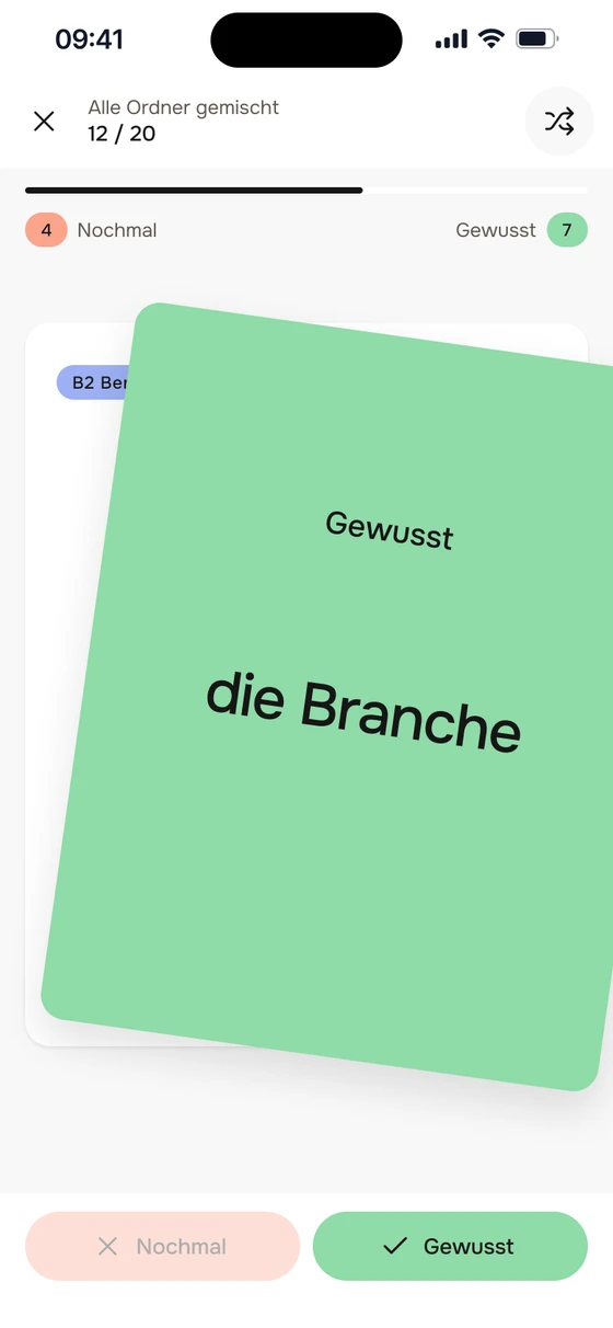
Flashcard dragged left on a phone: again
Flashcard dragged right on a phone: got it

In the app: drag left for again, right for got it

Flashcards you can swipe

Drag right for “got it”, left for “again”. The card tilts and fills with the answer’s colour, and the next card is already underneath. The buttons stay for people who don’t swipe.

05Flows

More flows, desktop and phone.

Some more flows on one sheet. Open it full size, then drag to move around and pinch or use + and − to zoom.

06What’s next

How I’d know it works.

Not launched. If it were, I’d follow people from the day they create an account and watch three numbers.

Activationnew accounts that finish a first practice task in their first session
Week 1new accounts that practise on 3 or more days in their first week
Mock testfirst mock tests that are finished, not abandoned
Back to top